Graphic details: how Visualizing Palestine designed a fight for justice
Asa Winstanley
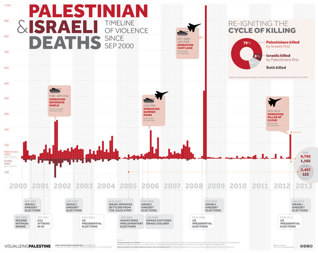 |
Visualizing Palestine infographic compares Palestinian versus Israeli conflict-related deaths (view full size)
January 24, 2013
Visualizing Palestine (visualizingpalestine.org) is a project which "uses creative visuals to describe a factual rights-based narrative of Palestine/Israel," says its website. It debuted in February last year with a stunning graphic illustrating the effects of hunger striking on the human body. Its release coincided with political prisoner Khader Adnan concluding an epic 66-day hunger strike that led to his release from Israeli internment.
Spread online via social networks, the group has since released several more "infographics" illustrating aspects of Israel’s systemic violence and discrimination against the Palestinian people. The work is distributed under a Creative Commons license, which means it can be freely shared under certain conditions.
Speaking over Skype, Visualizing Palestine’s co-founder Ramzi Jaber said the idea arose during 2011 in Ramallah. A lawyer from Defence For Children International - Palestine Section told him an astonishing statistic: an average of 700 Palestinian children a year were then being incarcerated in Israeli jails.
"I realized that I was shocked … this was happening," said Jaber, "[and] shocked double because I didn’t know these numbers, as [someone from the] Palestinian diaspora, born in Jerusalem. I realized there is a huge amount of numbers everywhere … it’s one of the most well-documented causes in the world."
It was decided the new group would combine the power of stories and statistics with design. The aim of Visualizing Palestine is "the same as EI [The Electronic Intifada] in some ways … to shed light" on the situation in Palestine.
In November, I had a chance to catch up with Ahmad Barclay, who was in London at the time. An architect, Barcaly works on research and visual direction for the group. I asked him about the motivation behind Visualizing Palestine, in this edited interview.
Asa Winstanley: You’re drawing on a lot of already existing reports and statistics, making them more accessible.
Ahmad Barclay: Possibly the main driver in what we’re doing is, there’s not a lack of information about Palestine — that’s clearly not the problem. It’s to do with how that’s being disseminated — like if there’s a 200-page report that explains the situation facing child prisoners or whatever under Israeli custody — that’s not going to be read by the mainstream public.
AW: A lot of those reports are mostly read by people who are also writing those kind of reports, unfortunately.
AB: Those things are getting reported but they’re lost in the news cycle you can get lost even as someone who wants to find information like basic facts [so Visualizing Palestine] is about spreading [the word] on Facebook, social media and hopefully reaching beyond the core pro-Palestine [audience].
AW: Tell me more about the group itself.
AB: [We] have designers, people more research-minded, people more outreach-minded. Basically, the core team is around six people that are working anything between five days a week to one day a week on the project. And then beyond that there’s a much wider network. A very important aspect is trying to verify, making sure that the message we’re trying to communicate in the graphic is accurate and that it’s to the point as well.
130124-visualizing-palestine-2.jpg
Visualizing Palestine infographic on bus lines serving Israel’s illegal settlements (view full size)
AW: What’s next for Visualizing Palestine?
AB: We really want to create a sustainable platform [on] the financial side [but also make] use of the connections we have in terms of research, in terms of design. It’s very difficult working on a project where people are in different places and you’re trying to get something coherent going through tools like Skype, Google Docs. So for me that’s the big challenge and beyond that we want to be producing more infographics.
From the beginning there was an aim to do more animation-based materials and we haven’t [done any yet]. We do have [enough people] within the team, it’s more the time and the resources to do it. It is [time consuming and expensive] and also you have to get the story right. If you don’t get the story right, you can put a lot of time into it and it doesn’t have the right impact that you want it to have.
Asa Winstanley, associate editor with The Electronic Intifada, is a journalist in London who has also worked in Palestine.
|

No comments:
Post a Comment